Redesigning design handover process
Company
Novade
Product
Novade Lite
Year
2023
Understanding The Problem
The designers at Novade were using Figma as our main design tool and Zeplin as our design handover tool for a few years. However, as the product scaled, it was becoming increasingly difficult and confusing for all parties involved.
The problems, in a nutshell, were as followed:
- Slow performance of Zeplin due to a large number of design frames uploaded
- Designers needed to update and maintain design components on 2 platforms (Zeplin and Figma)
- Developers, designers, and PMs were uncertain what should be the correct and latest version on production since there were many iterations, archived designs, and validated designs that are put on hold (lack of a single source of truth).
Moreover, the reason why Novade design team decided to use Zeplin in the first place was to facilitate communication between the devs, designers and PMs. With constant improvement done to Figma, we could now perform the same actions in Figma that we were making in Zeplin, making it clear that we needed to restructure our design files organisation and the way we handed over the design assets to the developers.
Challenges
New changes are always hard to adapt to because people are used to the current way of doing things no matter how unsustainable it may become in the future. In this case, there were multiple parties (Designers, PMs, and Developers) who would be affected by this new change.
My challenge: How do I ensure that the new process is as seamless as possible and does not create more frustrations for all parties involved?
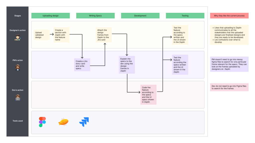
Current Process
I sat down with designers, developers, and the PMs to first understand the current process. I also wanted to know what made this process work and what could be improved.
Comparative Analysis
After analysing our design handover process, I proceeded to search design organisation best practices from other companies so that we could customise their methods to our needs to ensure a seamless transition.I looked to Spotify and Figma, the two established design focused company on how to structure their design files.
Spotify
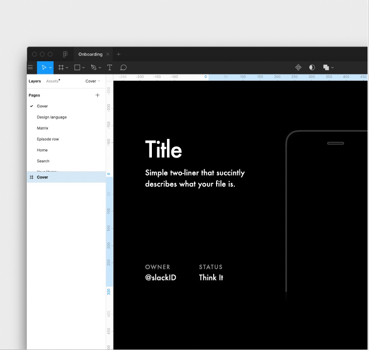
Cover Image
Spotify proposed to add a simple cover image as the first page to aid the browsability of files within Figma. The cover would be everything on the first page of the document. Spotify recommended changing the background of the page and adding a frame with information such as Title, Description, Owner’s name, Status, and Image.
See the example on the right.
Overview
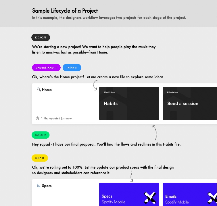
Spotify also recommended having different statuses in the exploratory projects such as
- Kick off
- Understand it
- Think it
- Build it
- Ship it
Dev would have to go look for the file in the explorary project type. And once, the product was shipped, designers would update the product project with the final design so designers and stakeholders could reference it.
Figma
Creating Projects
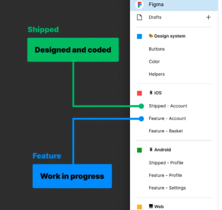
Figma advised creating Projects for each of the product’s user flows (login, registration, purchasing, search, user settings, etc).
Figma has 2 categories of projects:
- Shipped
- Feature
Page Structures
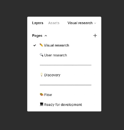
According to Figma, the page structure should consist of
- Visual research
A home for all those wonderful dribble screenshots
- User research
A space for user testing flows and concepts
- Discovery
A place to put rejected or rough ideas
- Flow
A place to pull together your formalized ideas into a structured canvas for feedback
- Ready for development
A space to organize our work once sign-off by the key stakeholders has been done
Solution
With insights gleaned from comparative analysis and from our current process of design handovers to dev, I dived into redesigning a user flow that would
- be able to scale
- solve the issue of the lack of a single source of truth
- be highly customised to suit our design team’s structure
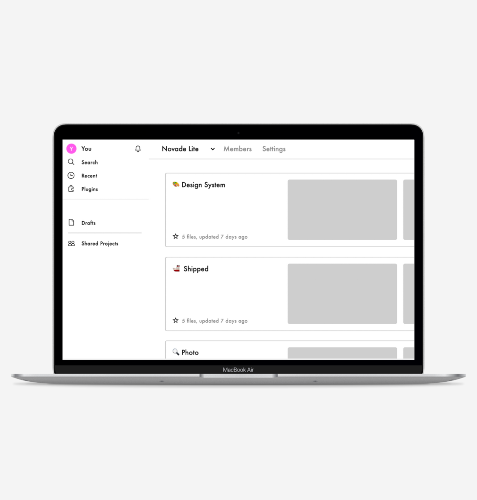
Organisation Hierarchy in Figma
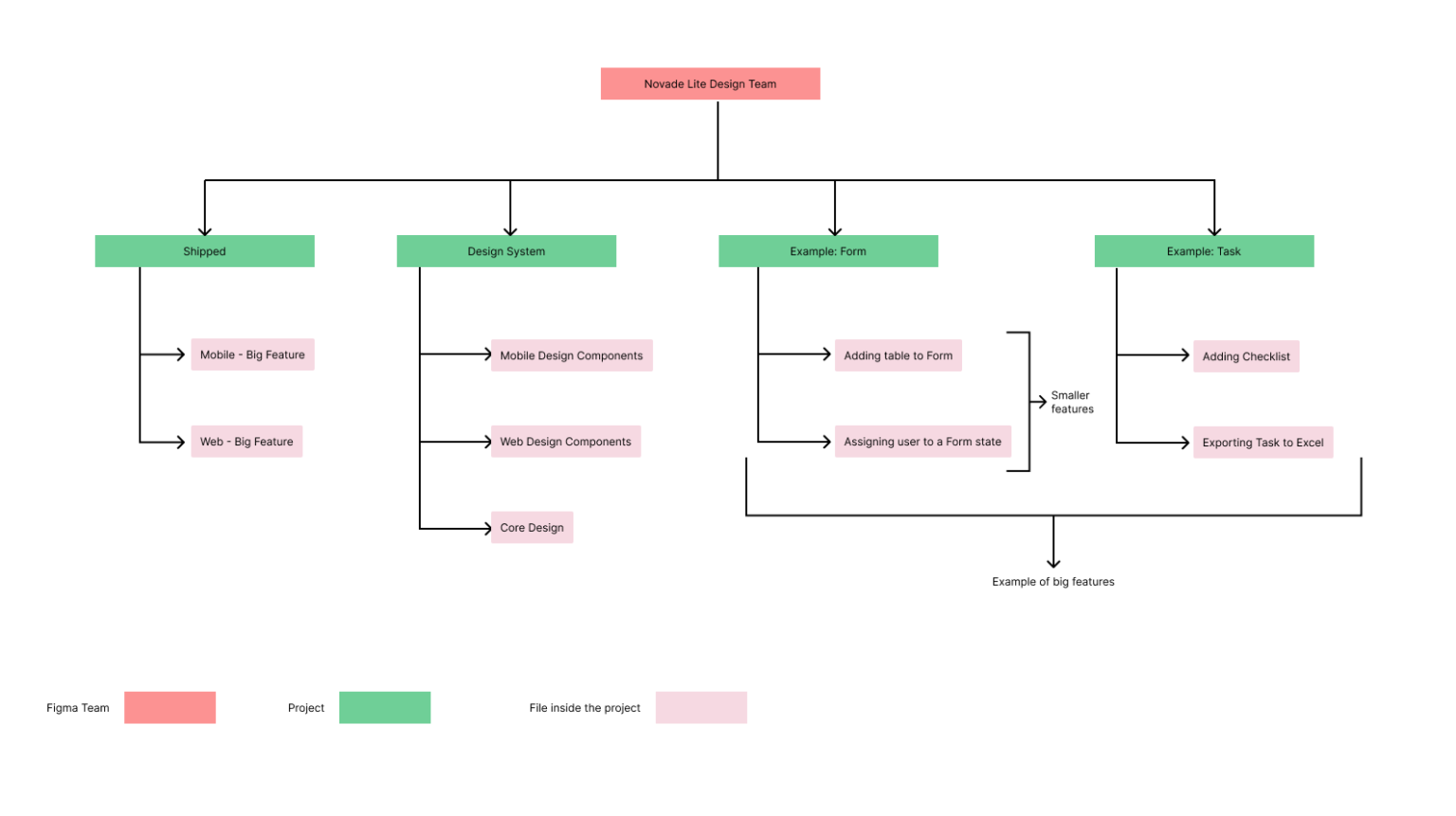
As shown in the chart above, under the Novade Lite design team, there should be different categories of projects:
- Shipped
Shipped project is where designers should keep the updated and live version of Novade Lite. Keeping a shipped project would ensure that all the stakeholder is clear on what should be the correct version at all times.
- Design System
This is where designers should house the style guide and design components.
- Feature
Novade Lite has multiple big features such as forms, tasks, drawings, etc. Under each big feature, there are smaller features such as adding a checklist to a task or adding a table into a form. Therefore, to ensure better browsability, each big feature should have its own project. If there is a flow under a big feature to be designed for (for example, adding a checklist to a task), a design file should be created under Project ‘Task’.
Formats and Naming Convention
Cover Image
As Spotify suggested, having a simple cover with enough information would help users find the design file faster

Statuses
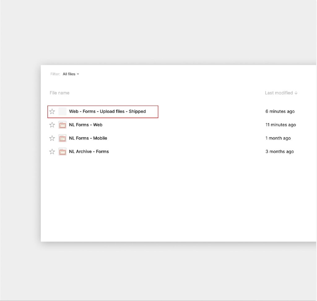
Having different statuses would facilitate better communications between designers and PMs because it would be clear which feature is at what stage of the project cycle.
Different Statuses
- In Progress
- Validated
- Reviewed
- Shipped
Page Structure
Considering our design workflow, following Figma’s recommended page structure would be suitable.
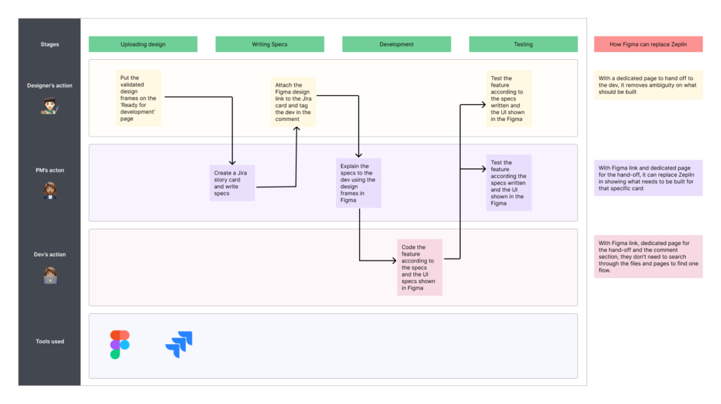
Designers would usually go UI research. Next, we would proceed to work on the flow which we would then present to the stakeholders. Once validated, we will upload our designs to Zeplin.
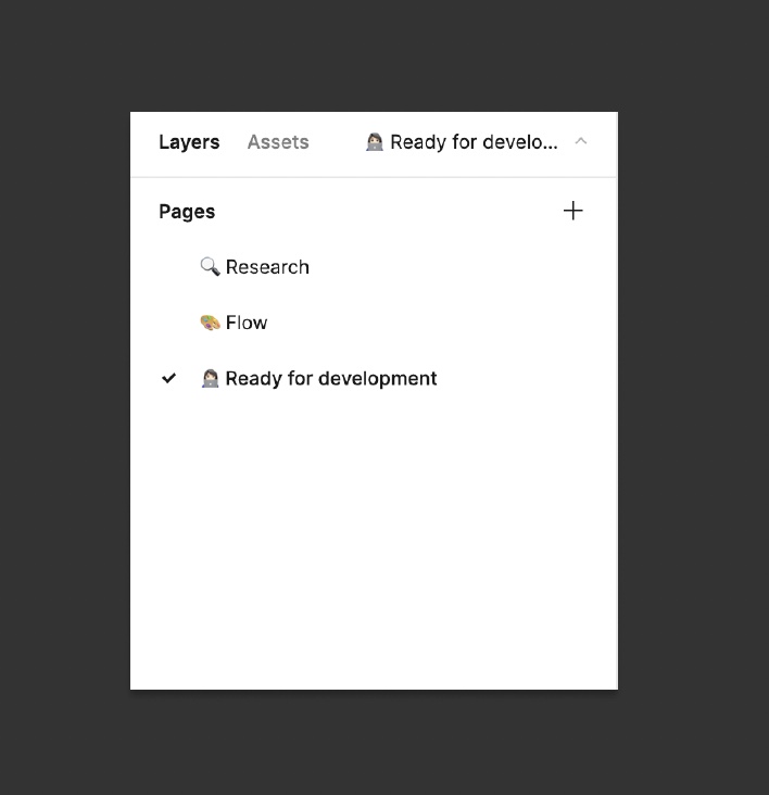
To accommodate this flow, there should be 3 pages: Research, Flow, Ready for development
Proposed Process
Introducing new changes
Although the changes were welcomed by the designer and PM team, there were some initial resistances to the change by senior developers. So, we agreed to test run this first by letting a few developers work on with the newly proposed flow.
Positive Feedbacks
“I like it this process better because I can see the overall picture of the feature that I am working on.”
“It is the same as Zeplin. I can view my paddings and style guide from Figma. “
‘To Improve’ Feedback
“Previously clicking on the Zeplin frame in the jira card would take me directly to the design frames. Now, since the figma link was for the whole page, it took a while to find the design frames related to the card.”
Solution
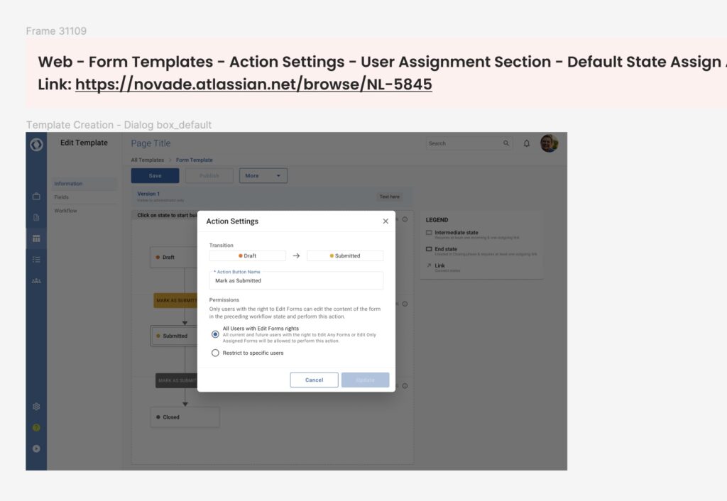
In Figma, you can create a link for frames. To help the developers find the frames with just one click, we decided to create a title frame for each jira and put the link in the related jira card. Thus, when developers clicked on it, it would take them straight to the designs frames related to the card.
After the test run, the senior developers saw the value and the ease in implementing the proposed flow for design handover. This is now the design handover process that Novade Lite design team is using today.
Conclusion
To recap, this project was to improve the design handover process so that it would be scalable and seamless.
Problems
- Slow performance of Zeplin due to a large number of design frames uploaded
- Designers needed to update and maintain design components on 2 platforms (Zeplin and Figma)
- Developers, designers, and PMs were uncertain what should be the correct and latest version on production since there were many iterations, archived designs, and validated designs that are put on hold (lack of a single source of truth).
Outcome
- Lesser work for designers to update the design components when there is a new change
- A single source of truth where all stakeholders are clear on the latest version that should be on production
- Reduction of number of applications used, reducing costs
My main takeaway from this project was learning how to persuade teams diplomatically to adopt my proposed changes. It was not enough to just come up with a solution. The solution needed to be adopted by all parties involved to declare the project a success.